Thursday, October 7, 2010
My Address is Changing
Hi -- Please note my new blog address. You can now find me at http://blog.osbornewood.com/besttaste where I will continue my observations on quality and good taste. Thanks, Tim
Tuesday, October 5, 2010
Trends -- A Great Kitchen Design
Another of my favorite sources for discerning trends is VERANDA magazine. The October issue is so full of trends and ideas that I have had a difficult time settling on just one. It would be worth getting a copy of this issue just to read the World of Vanities article. This is a great review of the best current designs for bathroom vanity sink cabinets. But the pictures I keep going back to are the pictures from the Wood-Mode cabinetry ad on page twenty-one. This shows a nice alternative to the stripped-bare aesthetic for twenty-first century kitchens, and it really reflects my personal taste to perfection.

 Somewhere between the polar extremes of a kitchen that looks like a rococo ballroom and a space that resembles a moonscape must lie a place that is at once comfortable, inviting and clearly of our own time. I think the room in this ad does this perfectly. It follows the current trend in avoiding overly integrated cabinetwork by presenting a combination of finished wood contrasted with painted wood. The tall cabinet on the center of the back wall has the essence of a Louis XIII armoire as seen through the eyes of the twenty-first century. The glass fronted cabinet doors make reference to Directoire styling. The exaggerated chamfered corners on the island are reinforced with clean, straight legs that finish on inverted tapers. I am particularly fascinated with the thoughtful introduction of the breakfast nook into this kitchen. The nook – a 1920s innovation that has been sadly overlooked for the past three or four decades – is a really attractive way to incorporate informal dining adjacent to a working kitchen without having a negative impact on the work flow. It is a tucked-in space – and in this design the nook itself is set off with a really attractive wood arch that is supported by clean corbels on the left and right.
I am also intrigued with the use of the demilune console with the very smart looking tapered legs; the coloration ties it into the cabinet work and trim but the shape is unexpected and provides relief and contrast from the abundance of linear shapes. All of this resting on a wide plank light wood floor that is NOT using a high luster finish really combines to create an ideal kitchen for 2010.
Thursday, September 30, 2010
Welsh Dressers and Some Jacobean Things
Continuing with my favorite pieces, I want to show you a reproduction that I really like. It is a copy of a Welsh Dresser from the 1920s and represents furnishings designed for the Tudor Revival architecture that was popular in the 1920s and 1930s. Quality does not require that a piece be original or one-of-a-kind. It should – to reiterate – be a good design using excellent materials and produced with the finest craftsmanship. This piece meets all three criteria. It is scaled down a bit compared to an original eighteenth century Welsh dresser but the resizing was thoughtfully executed so the balance is intact.


One of these is a long server that could be a dresser base. It features handsome turned legs and excellently detailed and appropriate appliques. It could work as a sofa table or a hall entry table or as a buffet in the dining room. The other is a three shelf étagère. I just love these things – and they are not easy to find. They make wonderful bedside pieces with room for everything: a lamp, the book you’re reading, books you want to read, and plenty of room for coffee in the morning. They also work in sitting rooms, family rooms or as small servers in dining rooms where plates for upcoming courses can be stacked below. They also work well in home libraries with books sorted all about them. The turned legs on casters are just wonderful.
Monday, September 20, 2010
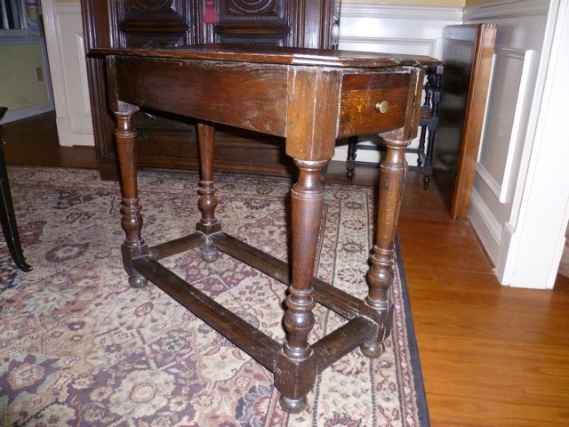
Great Wood Tables -- An Average Little Table with Some Surprises
Continuing with my favorite wood tables, I want to show you this neat little piece. This is a charming nineteenth century country French table in oak that takes its design cues directly from the seventeenth century. I love the sturdy turned legs that begin below the block with inverted spools followed by a trumpet turn that is begun with two scribed lines and finishes with a great flurry of turns and a block before quietly ending at a simple bun foot. Those supporting timbers at the bottom would really be more appropriately termed “rails” rather than stretchers as they really are substantial enough to rest ones foot on without doing damage. The feature that first drew my attention to this table, however, is the chamfered corners of the table top. The table is distinctly geometrical and heavy – almost to the point of boredom, but the neatly clipped corners relieve this and add enormous interest to the piece.

The leg design on this table, by the way, is not necessarily unusual but it is more typically seen on a much larger table. And this is the second point that drew me to this table. The elements – the sturdy legs and heftier-than-necessary rails – imply support for a larger table but this is a relatively diminutive table. It slips in very admirably as a sofa end table. When I am admiring it, I often wonder just what its original purpose would have been. The craftsmanship is competent but nothing exceptional; at a century and a half of age it is not loose or wobbly but the mortise and tenon joints are secured with undisguised pegs. This is a nice, homey thing to see but not the hallmark of fine cabinetwork so I assume a village cabinetmaker or talented rural amateur with a reputation for building sturdy kitchen or dining tables was asked to create this custom size. That would explain the heavier than necessary legs and rails. It is not a table that was consistently loved: when I bought the table it was rather filthy but what you see is the original finish after years of gentle cleaning, waxing and polishing.
I’ve never seen another table in this country style that is proportioned quite like this - and I have looked a great deal. A very good dealer in this sort of thing -- L'esprit (see item #36045) -- has a table that is similarly dimensioned but without the chamfered corners and with an even heavier rail priced at $1,600. I'm sure their table is worth that but I really prefer mine. I always enjoy seeing it and admiring its little cut corners and oblong proportion. And in a modern interior it adds a great deal more interest than a brand new table would be able to offer. It has no style name to describe this – the best effort would be that it is a country French vernacular table of the middle to late nineteenth century. But the wood, the dark finish and the overall weighty feeling is generally associated with Normandy – although it really could be from any rural region of France – or even Belgium for that matter. In some ways, this table sort of reminds me of a mixed-breed dog; stronger and better put together than its pedigreed counterparts, it has one or two features that more than compensate for its otherwise ordinary and clunky appearance. And it has endured in spite of the fact that it has not been particularly cared for – you have to love a survivor.
Monday, September 13, 2010
Great Wood Tables -- A William & Mary Table
 |
| Closeup of stretcher |
 |
| William & Mary Side Table c. 1700 |
But guess what? This style has become popular again – in many quarters and at prices for every budget. For example, Walmart is offering a copy of my table at just under $300. It could suit, I suppose but there is something squatty, square and clumsy about this table. Then Frontgate is offering their copy of my table at $1,400. The proportions are better than the Walmart version but the stretcher is flat cut and that somewhat takes the joy out of it for me. These numbers are interesting by the way. I paid about twice the current Frontgate price for my table in 1990. I was recently offered twice that but my table is not for sale so it’s a moot point. This is also a good example of the wisdom of investing in quality antiques. I’m pretty sure the Walmart table will have no value in twenty years; the Frontgate table will probably be worth what the Walmart table is selling for now. Meanwhile, if you can find one for sale, the antique table will be worth at least what it is now and quite possibly a bit more.
Tuesday, September 7, 2010
Quality Design Trends


Thursday, September 2, 2010
Mix and Match
One of my favorite things about my own rooms is their mix and match aspect. There is something to be said for the uniformity of suites of furniture in commercial settings – and the eye seems to yearn for perfectly matching wood tones and repeating features on legs – but, as the old saying goes: be careful what you wish for because you might just get it. Daily exposure to redundant colors and perfectly repeating patterns can become mind numbing. To my mind, the perfect interior is one that begins with a core plan that rarely if ever changes – such as the general seating arrangement and the basic color scheme – but that over time is updated and upgraded. Nothing shocking – just a slightly inferior painting replaced with a better one or the space occupied by a not so fine table this is one day replaced with an extremely fine piece of the same dimensions. I look at pictures of my house from twenty years ago and the essence of my present day rooms existed even then. The changes are not so shocking but have been a pleasant and protracted development as circumstances and opportunities for better things presented themselves. Unless you are a designer, designing your rooms should not consume your life. Your rooms are the backdrop to your life. It should be done well one time and then maintained and infrequently updated across the course of your life.
Tuesday, August 31, 2010
A Better World -- Really?
This is sort of an extension to my haranguing on quality – and hopefully a conclusion to the topic. Upon his return from town yesterday, my boss made an observation to the effect that it is sad how older people refuse to embrace technology. Implied in the statement is the notion that spending time becoming familiar with every new innovation that comes down the pike will somehow improve the quality of life. My poor boss: what he doesn’t know – and what he cannot know until he has lived for another twenty years or so – is that most technological innovations represent an increase in the amount of time that an individual must invest in getting a reaction that is inferior to the one received prior to the innovation.
The best case in point that I know of is the steady decline in communications since the advent of the virtual switchboard. Prior to the “press one for sales; press two for more sales” era, an actual person answered company telephones (usually within two rings). This person, known as the “switchboard operator” did not waste your time by reciting a menu of options but instead immediately directed your call as instructed. The switchboard operator, usually a woman, was also aware of the whereabouts of everyone in the building at any given point in time and was capable of taking messages (for those who were too low on the totem pole to have a secretary) or was capable of tracking people down immediately if the call was urgent. I think it is very easy for anyone to see how this is a superior system on several points. The most obvious is that there was NO phone tag when switchboard operators existed – the operators knew where everyone was. Also, I really appreciated the fact that companies did not waste my time by reading their useless menus to me. I think we all know that it doesn’t matter whether you press “one” for sales or “two” for existing orders: these calls are all going to the same place in the end. Older people know this because we’re the ones who invented the stupid technology in the first place.
And the poor man who invented the virtual switchboard – I cannot recall his name and it won’t come up on Google search – actually made an apology to the country on national news in the 1980s, saying that it was never his intention to have it be used the way it ultimately came to be used.
Another reason marked difference between the ways different generations approach technology is that we (we being the older generation) were the generation that endured the transition from full service to no service. This was rather like boiling lobsters. You know, they say that if you place a lobster in cold water and gradually raise the heat to boiling the lobster never knows it. Well, I don’t know if that’s true or not – but I know that each time we accepted an inevitable change in business in the 1980s and 1990s, the change invariable meant more work to be done in an increasingly less efficient fashion. As new technology was being introduced, it was our understanding that some new set of underlings would operate the crap. It is an apparently forgotten phenomenon but many of the derogatory acronyms we use today originated in the 1980s and 1990s to describe this sort of work. You know the way WYSIWYG (what you see is what you get) described the first time we had been able to actually see what we were typing on the screen in the manner that it would print? Well, terms like “dweeb” came along to describe other new things. It amazes me that an internet search dumps the term “dweeb” in with “nerd” and “twerp.” But in the mid-1980s we used “dweeb” to describe a functionary whose entire responsibility was to make the perpetually evolving technology operate. I’m not talking about I.T functions. I’m talking about conversations like “Hire a dweeb. We’re paying you too much to be typing,” (or doing keypunch or to be setting up forms or anything else that was done on a computer. And a “dweeb” was “dumb-work -- electronic execution business.” This was the person who operated the increasing number of early DOS programs – such as Lotus 1-2-3 – and basically you “dweeb-ed” everything if you were mid-level management or higher. The dweeb did the input and print out – and you marked it up and handed it back to him or her to input the corrections. This, by the way, was replacing green-bar reports that had previously been handled in much the same way (somebody did the actual writing or typing and the mid-level manager reviewed and commented).
Now, twenty years later, poor mid-level managers and even department executives must do their own report generation and then comment on them. And this is better? I’m not so sure. I still liked it when directors began sentences with “We pay you for your expertise – not to type.” I would love it if someone would say that to me today. So, for my young boss I would only say: let’s get together in twenty years and see how you feel about technology. I have a feeling that our perspectives will more nearly align by then.
Monday, August 30, 2010
More Notes on Quality
The company I work for, Osborne Wood Products, presented a large booth at the International Woodworking Fair in Atlanta last week. It was the first time I have had a chance to work on the exhibitor side of such a fair, and it was a revelation to learn how much hard work goes into the preparation and setup for an exhibition of this size. It also requires a dedicated and cooperative staff in order to succeed. We were fortunate in that each person discharged his or her duties excellently so that one might say everything came off as perfectly as can be expected.
Even though absolute perfection is rarely if ever attainable, striving for perfection at the outset of any project is a good goal and is an aspect of quality. In our particular situation, the conceptualization and actual production of the elements of our booth and its components had been worked on for months with an eye toward reminding our clients of who we are and what we produce in addition to showing them where we are headed. The booth components have been being set up in our company gym for most of the summer so no surprises would occur when the actual setup occurred in Atlanta. Imagining potential problems and solving them before they occur is an important way to ensure a quality outcome.
In addition to this, the staff for the booth was selected to represent every phase of our operation from design to customer service to production to shipping. One of the most interesting things to observe was the way these eight people fell into a pattern of duties each morning without them having to be assigned. Each intuitively understood that the booth needed to be refreshed and cleaned so it would look as new as it did on opening day. Each staff member finished getting the area buffed up and assumed a position along the perimeter of the booth to begin greeting the day’s attendees. This sort of attention to detail is an important aspect of quality.
It is said that the proof is in the results. That being said, at the end of each day of the exhibition I was astonished and impressed to realize the number of people who had stopped by our booth who already do business with us and who really wanted to convey their appreciation for our delivery of quality. At some point during each day of the fair, each one of our departments was commented on at least once. I had people tell me how much they appreciated the way the customer service reps check back with them about their orders after they’ve shipped. Others commented on the quality of the base materials or on the craftsmanship of the finished products. Still others were impressed with the care with which our merchandise is packed for shipping or with the way we try to stay ahead of the design curve by studying trends and making sure we are including current designs.
So in addition to the fine materials and excellent craftsmanship that I discussed previously, I would have to add that the amalgamation of components that culminates in quality would also include quality ideas, quality relationships, and high quality work ethics. I would also venture to say that total quality can only come to full fruition when it is cultivated in a culture of quality. I would describe a culture of quality where the notion of quality is recognized and fostered as a desirable approach to life and not merely a marketing ploy. I suspect that an insincere nod to quality is not sustainable for the long haul.
On a personal level, it feels very good to realize that one is associated with quality. It is much nicer to have the opportunity to spend the day saying “why, thank you so much” over and over again than to have to keep saying “I’m so sorry that happened to you – I’ll check into it right away.” The former is the pleasant result of years of nurturing quality on every level. The latter is the inevitable outcome of combining poor materials and production with bad attitudes and worse environments. I’m a lucky boy: I get to work with quality.
Tuesday, August 24, 2010
The Requisites of Quality
There was an article on CNBC last week that announced “Death of the McMansion: Era of Huge Homes is Over.” If only it were that simple. The article is reporting on a trend away from houses with 3,200 or more square feet toward a new ideal size of less than 2,000 square feet. The article further defines a McMansion as follows: “They’re tacky, they lack a definitive style and they have a displeasingly jumbled appearance.” All of this is true but what really concerns me is that the biggest crime of all is never mentioned in the article: McMansions represented either complete ignorance of -- or complete indifference toward – the essential requisites of quality on the part of the buying public. And I truly fear that this particular damage may be irreparable. We have an entire generation of people who aspired toward huge residential structures that were built of materials that wouldn’t have passed muster for a mobile home buyer a generation earlier. If these people were satisfied to own big shabby houses, then the only difference is that the shabby houses are now getting smaller. The smaller houses will still contain inferior components. I can think of three McMansion ghosts that I fear may haunt us for a long, long time. They are: prefab fireplaces, fiberglass bathtubs, and low quality wood floors with polyurethane finishes. There is nothing inherently evil about any of these but they are of inferior quality, use inferior materials and have no lasting value. They are shams designed to appeal to the eye, but there is more to quality that the visual. In fact the visual is the least reliable indicator of quality. Quality is largely tactile. True quality is a happy marriage of superior materials and first rate craftsmanship. You can see it but more importantly: you can feel it.
Prefab fireplaces almost always give themselves away because of the three or four inch difference between the hearth and the firebox. On a real fireplace, the hearth flows evenly into the firebox. That little strip of metal – sometimes veneered with a strip of polished marble – should raise an eyebrow. Furthermore, there is nothing more ridiculous in appearance than the “chimney” of a prefab fireplace assembly floating off the ground with no support and rising into the air wrapped in wood. This presentation was originally designed for use in very, very inexpensive starter homes in the 1970s. No one at that would have ever believed that as the buyers became more affluent they would be content to place this truly ugly feature on more and more expensive houses. If finally came to the point that – even on McMansions – no one even tried to camouflage the fact that the fireplaces were not real. The more important issue was that the house could boast five to ten of the cheap units. Just so you know: at this moment in Georgia, a real masonry fireplace in brick with no stone, limestone, or marble overlays and with no exceptional mantelpiece costs anywhere from $12k to $18 depending on how much footing and support must be prepared. So, if you know someone who has a real masonry fireplace you should be very, very impressed. If, however, you know someone with four or five prefab fireplaces – don’t call attention to them because it doesn’t mean too much. At $2,500 to $3k apiece, five prefab fireplaces don’t add up to the cost of a single, tall masonry fireplace.
Using an acrylic bathtub feels like bathing in a plastic milk carton. The absence of quality is literally palpable. There is admittedly a range of qualities offered that run the gamut from thin and bouncy to “looks like porcelain.” But at the end of the day we are discussing a range of quality within the scope of a seriously cheap product. And yet this cheap product became the national standard during the McMansion era. Initially seen only in – again – cheap starter homes and cheaper motels, integrated fiberglass and acrylic tub units were originally manufactured to fill a niche market where time was of the essence and quality of no concern. Using an integrated unit saved on the material and time involved in installing ceramic tile surrounds. And then the manufacturers noticed that there was a considerable increase in earnings to be made on savings in freight between the lighter fiberglass tubs and the heavier porcelain and cast iron tubs. The best American manufacturers, such as American Standard, developed such things as “Americast” (a fancy name for a plastic tub) and began a very successful marketing blitz so that the uninformed public just accepted the cheaper tub as a better tub. I was working in design at the time this occurred and we were told by our plumbing reps to point out to the client that a porcelain and iron tub was cold but the fiberglass tub was not. Well, that is a stupid thing to tell anyone who knows that cast iron, once heated, holds the heat for a very long time whereas plastic – while not cold – will not get warm either. In any event, most of my older clients would tap the new tubs with their fingernails and say “Oooh – I don’t think so – it’s plastic.” But younger clients seemed to be just fine with it. Now, there are only two cast iron models with integrated aprons remaining: one each from America’s leading manufacturers. American Standard offers the Spectra and Kohler has the Bellwether. The balance of bathtub choices is from a wide array of acrylic models. So, if you see a house with over-sized soaking tubs or fancy styles and shapes of bathtub – don’t be too impressed. If you look at a new house with a simple tub, and you tap the tub, and it feels rock solid and smooth as glass and cool to the touch, be impressed. The person who chose the latter tub recognizes quality by the touch.
Finally – it is very sad to consider the shoddy flooring that the public has accepted for the past thirty years. “Hardwood floors” has come to describe anything except quality and craftsmanship. To begin with, true hardwood floors needs to be milled lumber that has dressed thicknesses of at least 7/16”. Beyond this, it is important to know that all wood is not created equally. Before the McMansion era, it was understood that the typical home buyer could recognize the difference between common flooring and select flooring. Select flooring even had a best-of-the-best grade with AAA clear select being the absolute best wood flooring that anyone could have. Even in situations where a marginally good supply of real hardwood has been supplied for flooring, the craftsmanship of installation may really be irretrievably lost. Suffice it to say that there is no way on earth that you can put a polyurethane finish on wood floors and have anything close to quality. Again: polyurethane finishes were developed for use in inexpensive starter homes as a way of expediting the turnover time in construction. By the 1970s, very few low end homes presented any wood flooring at all but when it did it was typically finished in poly. By the 1980s, tract houses built on spec for the step up market began to feature wood floors in entrance halls and dining rooms as a sign of elegance. These were, of course, finished with polyurethane, so the buyers gradually came to accept this method of finish as the standard. By the time the full blown McMansion era was up and running, no one questioned the wisdom of spraying polyurethane on acres of wood flooring. So what is the problem with a poly finish? Well, assuming you have actually acquired good wood material, you might as well wrap it in Saran Wrap as spray it with polyurethane. Wood sealed in poly is frozen in time. It will never age properly; it will develop no patination whatsoever; and the depth of reflection will carry a clearly artificial appearance. Really, you might as well use linoleum – the end effect will be much the same. Many finishers advertise traditional finishes. How can you tell if you’re getting one? Well, aside for the fact that you should train yourself to be able to see the difference, you will know that you do not have a hand rubbed wax floor finish if you can walk on the floor twenty-four hours after it is finished. Polyurethane dries extremely quickly. A convention finish will take a week to ten days depending on the weather and requires thin coats of natural varnishes that dry completely and are then lightly sanded before the application of a second or third coat. And all of this is followed by paste wax that is allowed to dry hard before buffing; a procedure that is repeated three times at least. When you have seen the end result of the latter you will find a polyurethane finish to be inferior and repugnant.
So, I sincerely hope that in addition to trimming back on the square footage of the average American home we recover some of the good taste and recognition of high quality that we used to possess prior to our little thirty year detour through junk land.
Monday, August 23, 2010
Designing or Decorating?
I had the most splendid Sunday Dinner yesterday – protracted and unhurried and seasoned with pleasant conversation just like a traditional Sunday dinner should be. One of my guests was a young woman with whom I finished graduate school last year at the University of Georgia. She is now lecturing on interior design at the university and I was curious to know how that is working out for her. She said she is enjoying it – and she should be. She is very talented and educated on her subject and she is also articulate. One thing she mentioned, however, has puzzled me. She said she was surprised at the number of people in her introduction to interior design class who said they had taken the class so they could learn how to put together a pretty room. My friend had to inform them that interior design was not about making pretty rooms. Although pretty rooms are a part of it, it is a small part compared to other things. I was sad to hear her say this but the more I thought about it the more I realized that she is speaking the truth. Interior design is decidedly not about beauty, taste or quality; that is the purview of interior decorating. And interior decorating has been suffering at the hands of interior design for about twenty-five years now in an effort to confer professional dignity on those who choose to pursue careers in what essentially comes down to embellishing the backdrops of people’s lives. In this instance, the act of decorating has come full circle because a professional interior designer is in essence a not-quite architect at worst, or a specialty within architecture at best.
I say this has come full circle because in the eighteenth century, for example, architects held full sway over the arrangement of furnishings in the public spaces of their extremely sculptural architectural creations. Versailles Palace is a case in point with arrangements of console table followed by chair followed by console table lined up like soldiers along the corridors as a sort of movable architecture designed to set off the pilasters. Then there are the state bedrooms that were pure stagecraft and from which the assigned residents would escape to more comfortable quarters as soon as the ceremonial part of going to bed was completed. The state rooms were the results of Design. The private apartments were decorated and the decorating -- as opposed to design -- reveal insights into the personalities of the occupants that the jaw-dropping opulence of the state rooms could never reveal.
Architects were slow to give up control of the interiors of their creations. A greater degree of the residential interior was given over during the nineteenth century partially as a result of the emerging middle class that could afford a draper and upholsterer to guide them through the design options, and partially because some women were raising their voices against house designs and furnishings that required exhaustive levels of housekeeping. By the turn of the twentieth century, the idea of an interior decorator was pretty well on its way toward being an acknowledged part of home design. Edith Wharton in conjunction with architect Ogden Codman, Jr. published The Decoration of Houses in 1897 which, among other things, strongly implies that taste is not subjective; the components of good taste can be identified and discussed objectively. Following the publication of Wharton’s book, the twentieth century saw the emergence of women as some of the most notable arbiters of good taste and inventive decorating trends. Dorothy Draper, Rose Cumming and Sister Parrish are but three whose influences are still felt. Yet, by the 1980s, decorators began to morph into designers. Why? I strongly suspect that many in the field lacked the inherent talent to become true decorators and so began the push for professional recognition and the title of designer because – truth be told: it is possible to teach the mechanics of design such as appropriate door placement for ADA compliance and correct widths on passage corridors. But you cannot teach scale or how to mix two patterns together successfully. You can teach color theory and discuss things in terms of warm and cool but you will never teach the talent that intuitively takes the minutest color found in an Oriental carpet to use as the trim color on an upholstered chair. It’s the difference between a professional illustrator and a talented artist. From one you will get a consistently satisfactory representation; from the other you will receive soul stirring imagery.
Some of the most beautiful work I have ever seen is the result of collaboration between a highly talented interior decorator and an inspired architect in which each is bringing the best available from his or her education and experience. The example I am including is the result of collaboration between the enormously gifted architect, Norman Davenport Askins, and the highly talented interior decorator, Marie B. Warren. The mantelpiece shown is the result of their joint efforts on a project from 1998. Mrs. Warren had seen the bronze fluted columns with the Ionic capitals in a shop a few years earlier. Having no immediate use for them, she found them to be inspiring and bought them to have on hand for when a suitable occasion arose. While working on this particular job, she and Norman Askins were brainstorming about how to develop the space that would ultimately become a combination library dining room. Askins introduced the notion of creating custom woodwork in mahogany from his own designs. Warren loved this idea and began to develop the color scheme that would ultimately settle on the red lacquer that is seen in the picture. Askins sent some initial drawings over to Warren that included the first draft of a mantelpiece based on a classical design including the columns – but in wood. Warren recalled the bronze columns she had kept stored for two years and sent them to Askins office.
Askins found them as appealing as Warren and the end result is the absolutely stunning mantelpiece you see in this picture – a happy marriage between design and decorating.
Now, I am not saying that decorating is more or less important than designing. But I do say this: when you decide to bake a cake and you are considering how many people you need to serve and whether you want a sheet cake or a layer cake and whether it will be yellow cake or chocolate cake – you are probably designing the cake. But when you begin to decide to use white frosting to set off the appearance of the chocolate layers when the cake is sliced – or you decide to drizzle chocolate on the white icing – or you decide to make traditional pink and yellow swags and roses – you are clearly decorating the cake and in the end, what do you think people will remember: That your cake exactly served the precise number of people it was designed to serve? Or that it was beautifully decorated? My guess is the beauty, which is why I will always want my cakes (and my rooms) decorated rather than designed.
I say this has come full circle because in the eighteenth century, for example, architects held full sway over the arrangement of furnishings in the public spaces of their extremely sculptural architectural creations. Versailles Palace is a case in point with arrangements of console table followed by chair followed by console table lined up like soldiers along the corridors as a sort of movable architecture designed to set off the pilasters. Then there are the state bedrooms that were pure stagecraft and from which the assigned residents would escape to more comfortable quarters as soon as the ceremonial part of going to bed was completed. The state rooms were the results of Design. The private apartments were decorated and the decorating -- as opposed to design -- reveal insights into the personalities of the occupants that the jaw-dropping opulence of the state rooms could never reveal.
Architects were slow to give up control of the interiors of their creations. A greater degree of the residential interior was given over during the nineteenth century partially as a result of the emerging middle class that could afford a draper and upholsterer to guide them through the design options, and partially because some women were raising their voices against house designs and furnishings that required exhaustive levels of housekeeping. By the turn of the twentieth century, the idea of an interior decorator was pretty well on its way toward being an acknowledged part of home design. Edith Wharton in conjunction with architect Ogden Codman, Jr. published The Decoration of Houses in 1897 which, among other things, strongly implies that taste is not subjective; the components of good taste can be identified and discussed objectively. Following the publication of Wharton’s book, the twentieth century saw the emergence of women as some of the most notable arbiters of good taste and inventive decorating trends. Dorothy Draper, Rose Cumming and Sister Parrish are but three whose influences are still felt. Yet, by the 1980s, decorators began to morph into designers. Why? I strongly suspect that many in the field lacked the inherent talent to become true decorators and so began the push for professional recognition and the title of designer because – truth be told: it is possible to teach the mechanics of design such as appropriate door placement for ADA compliance and correct widths on passage corridors. But you cannot teach scale or how to mix two patterns together successfully. You can teach color theory and discuss things in terms of warm and cool but you will never teach the talent that intuitively takes the minutest color found in an Oriental carpet to use as the trim color on an upholstered chair. It’s the difference between a professional illustrator and a talented artist. From one you will get a consistently satisfactory representation; from the other you will receive soul stirring imagery.
Some of the most beautiful work I have ever seen is the result of collaboration between a highly talented interior decorator and an inspired architect in which each is bringing the best available from his or her education and experience. The example I am including is the result of collaboration between the enormously gifted architect, Norman Davenport Askins, and the highly talented interior decorator, Marie B. Warren. The mantelpiece shown is the result of their joint efforts on a project from 1998. Mrs. Warren had seen the bronze fluted columns with the Ionic capitals in a shop a few years earlier. Having no immediate use for them, she found them to be inspiring and bought them to have on hand for when a suitable occasion arose. While working on this particular job, she and Norman Askins were brainstorming about how to develop the space that would ultimately become a combination library dining room. Askins introduced the notion of creating custom woodwork in mahogany from his own designs. Warren loved this idea and began to develop the color scheme that would ultimately settle on the red lacquer that is seen in the picture. Askins sent some initial drawings over to Warren that included the first draft of a mantelpiece based on a classical design including the columns – but in wood. Warren recalled the bronze columns she had kept stored for two years and sent them to Askins office.
 |
| Classical Mantelpiece: Norman D. Askins and Marie B. Warren |
Now, I am not saying that decorating is more or less important than designing. But I do say this: when you decide to bake a cake and you are considering how many people you need to serve and whether you want a sheet cake or a layer cake and whether it will be yellow cake or chocolate cake – you are probably designing the cake. But when you begin to decide to use white frosting to set off the appearance of the chocolate layers when the cake is sliced – or you decide to drizzle chocolate on the white icing – or you decide to make traditional pink and yellow swags and roses – you are clearly decorating the cake and in the end, what do you think people will remember: That your cake exactly served the precise number of people it was designed to serve? Or that it was beautifully decorated? My guess is the beauty, which is why I will always want my cakes (and my rooms) decorated rather than designed.
Friday, August 20, 2010
Making a Grand Entrance
 |
| Fontainebleau Hotel - original lobby design (circa 1955) |
 |
| King & Prince Hotel - original lobby area (2008) |
Of course, a space does not necessarily have to be “grand” in dimensions to feel grand. I occasionally take a weekend at the grand old King and Prince Hotel at St. Simons, Georgia. I still prefer to enter the building through the original lobby. Frequently abandoned and unused except as a reception space, the original lobby has wonderful fluted columns and handsome iron banisters topped with polished brass railings, a coffered ceiling and polished stone floor, and inviting upholstered club chairs and sofas that present the setting I associate with a well-heeled hotel lobby. The room itself is not large, but there is a grandness there that is sadly lacking in the area currently used as a lobby. I loathe that place and only ever see it when I am checking in or checking out. I rarely eat in the hotel anymore because I simply don’t want to see a place that looks mostly like a dated food court in an aging shopping mall. Although the ceiling soars in the place, there is nothing grand about it. It makes for a very disappointing entrance, which is why I use the older lobby. Even in disuse, there is more character there and it sets a good tone for the weekend.Fortunately, nothing stays the same so one may anticipate a return to strongly articulated entrances at some point – I can hardly wait!
Thursday, August 19, 2010
The Power of Contrast
 |
| Greensboro Station Main Hall |
Be that as it may – I was delighted to see that the former Southern Railway Station was not only still standing but had evidently enjoyed a great deal of attention during the ensuing years. Shortly after my visit in 1974, Southern Railway gave the station to the City of Greensboro. The North Carolina Department of Transportation later got involved and what we now have is a beautifully restored facility that serves its original purpose beautifully and is presented as the J. Douglas Gaylon Depot.
The lobby of the restored Greensboro station is bright and light filled. About ninety percent of the interior is in lighter tones such as the terrazzo floor and plaster walls with polished stone embellishments. The remaining ten percent consists of dark stained oak wood that has been well restored.
 |
| Benches and Booths in Dark Oak |
Some designers avoid strong contrasts in favor of aligning a range of closely related values with a goal of creating serenity. Others introduce several sharp contrasts into a space, which is politely referred to as giving animation to a space – but really it is just jarring. The main hall of the Greensboro train station shows a use of contrast that is very nearly perfect. This is to be expected because, after all, they don’t call it neo-classical for nothing. The first thing to observe is this proportion: eighty to ninety percent lighter offset with twenty to ten percent contrast. The next thing that makes this successful is the choice of material: oak with a dark stain. This same effect could have been achieved with dark marble or dark paint. But a relief from the hard surfaces is achieved through the introduction of oak wood that adds warmth to what could have quickly been a visually cold – albeit attractive – space. In this particular instance, the architects chose against using ornate millwork the grain of the wood becomes the outstanding feature. Prominent pieces such as the train announcement board or the protrusion over the telephone booths make do with some simple and traditional oak crown molding as their only embellishment, which shows wonderful restraint.
The only problem with the beautifully restored Greensboro train station is that it makes you wonder why new airports can be designed to create a “gateway to the city” effect.
Subscribe to:
Posts (Atom)